


For one brewery in Germany, names of beers and the designs on the labels all tie back into the brewery’s values.
Since the craft beer boom came later in Germany than in the USA, the beer just wasn’t up to par for some Berliners who decide to start contract brewing. When American beer arrived via ship, it had already gone bad.
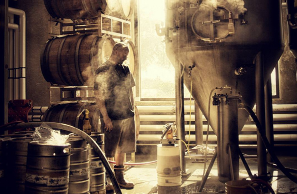
So Motel Minibar was formed, by four brewers who traveled from brewery to brewery using free space to brew their own American-style beer.
“A Motel is also a place that everybody knows, it’s simple and uncomplicated, it also evokes adventures and road trips… And that’s exactly what we want the people to experience with our beers,” said Creative Director Marie Stadelmann.
Instead of bottling beers like most German brewers, Motel went a different way and came out with cans. After the brewery was named, Stadelmann, a graphic designer began thinking of visual concepts for the beers’ labels that would align with the name and the brewers’ values.
Together, the brewers decided that each beer would have an imaginary motel name, “Motel Shady Pines, Motel White Sands, Motel Golden Lake,” Stadelmann told Brewer, “and a unique illustration that goes with it. The landscape illustration is like the view that you would have from your Motel Room.” 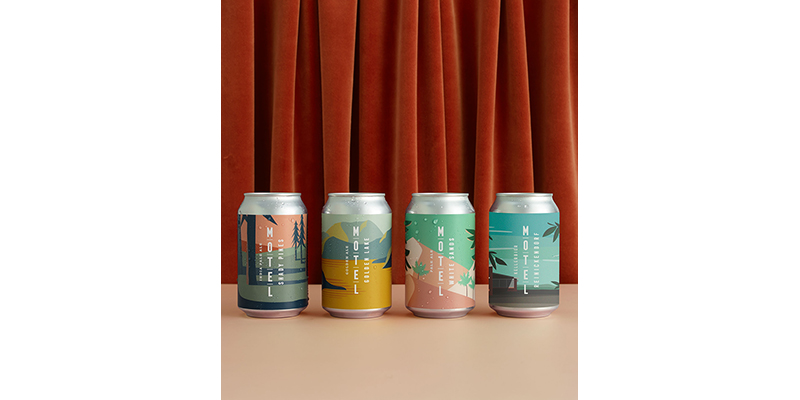
She gets her inspiration from early-to-mid 1900s travel posters and artists like David Hockney, Edward Hopper, and Hasui Kawase.
Each time a new beer is brewed, the brewers get together to brainstorm names for their beers, mostly inspired by the style and origin of the hops and flavor notes. After the names are chosen, Stadelmann starts sketching with a pen and paper before using Adobe Illustrator to bring her designs to life.
“I’ll do a lot of color combinations to find the right fit to express the beer style and vibe,” she said. “This whole process takes me around 2-3 days…I’m very lucky because the rest of the team give me total freedom for the design.”
Stadelmann said that there are a lot of amazing beer labels on the shelves right now, but many of them are masculine and beer-nerdy.
“We all really wanted to create a brand that everybody can relate to,” she said. “A lot of people give us feedback about the illustration, like, ‘It looks like this place we went in…’ or ‘It makes me think about this trip…’”
Stadelmann takes her time picking out color schemes that will stand out on a shelf. Motel is targeted to 30-somethings who are looking for high-quality products. She wants the designs to be approachable, just like the beer itself, so people will always reach for another one.
Stadelmann continues to fine tune the labels a lot, but she believes Motel will stick with its current concept.


1 Trackback / Pingback