Having a full-time member of your brewery that devotes all their time to graphic design can be a big step for a brewery. But even for a brewery like Angel City Brewery, stepping outside of the four walls of the building happens once in a while each year for label designing.
The Los Angeles brewery primarily uses its in-house team for art, but sometimes work with contractors and artists, depending on the launch.
“There’s so much consideration that goes into label design, which really does impact brand growth, and not always in the way you might think,” said the brewery’s Jennifer Henry. “We like to say great package design will only get you to try a beer once.”
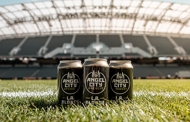
To tie into the local MLS soccer team, LAFC, Angel City developed L.A. Blonde. The beer is presented in a black-and-gold can to tie in with the team’s partnership, which was created in-house.
“Hopefully that gets a few people to pick it up, but it’s the beer inside that will bring them back for more,” Henry said. “So out in the world, having a can that’s easy to find, not too busy, doesn’t get lost, that becomes just as important as the label looking cool.”
Henry added that with the market being in a time when there are well over 7,000 craft breweries in the US, it’s incredibly important to have a strong brand and visual identity.
“We live in a time where you can’t just brew great beer, because there are a lot of other breweries doing just that,” she said. “You need to be able to stand out on a shelf, in a bar, anywhere that beer drinkers need to make a choice on what they want to drink. There’s a lot of competition out there and it’s more important than ever to stand out.”
Henry also said that the Angel City brewing team does a fantastic job doing R&D and pushing the envelope on classic styles. With L.A. Blonde, she said that they brewed the style years ago under a different name and it had always done well in the brewery’s Public House. In fact, it’s won silver twice at the Los Angeles International Beer Competition.
“We thought it would be a great style to help honor our partnership with LAFC,” Henry said.
And just like you are more likely to find a Pilsner brewed with Thai lime leaves at a brewery than a grocery store, Angel City’s limited releases are where it can be more playful with art. So, four times a year the brewery goes outside the office to work with Art Share L.A. and a local artist for a limited style it only sells at the brewery.
“Those cans are funky and unique, and we get to support our local art community in our own small way, which is really important to us,” Henry said. “The challenge really becomes how can you have your year-round styles be a little more minimalist and shoppable, and have your limited styles be a little more wild, and make sure both are authentically representing your brand and the people behind it?”
Angel City worked with Studio Number One on its current logo and year-round can designs.


Be the first to comment