

Using the power of design can help a brewery move forward. Sure, the beer has to be solid to continue the success, but snappy packaging when entering retail markets can be a key as well.
For Pigeon River Brewing in Wisconsin, entering the market in 2014 for bottled package helped boost growth. So much that the Brewers Association recognized Pigeon River as one of the fastest growing breweries for 2018. Coupled with that was that the brewery was honored with a 2018 American Package Design award as well.
“For us packaging has always been about more than just catching a person’s eye or standing out in the grocery store,” explained Pigeon River co-founder and owner Kayla Knaack. “We don’t just want to catch potential customers’ eyes, but we also want to be able to make them feel comfortable grabbing the six-pack to take home.”
Knaack added that packaging should be a reflection of the overall mission of the brewery and appeal specifically to the brewery’s target market.
For Pigeon River being located in a locale like Marion, Wisconsin (pop. 1,300) which is an hour west of Green Bay, the wheelhouse for it has always been to brew accessible, sessionable brews that would appeal to a blue-collar worker after a hard days’ work.
“We wanted our packaging to reflect that, so we chose muted colors and nostalgic imagery,” Knaack explained.
The brewery teamed with Quill Creative — a small design firm that was getting started at the same time that the brewery was looking to distribute.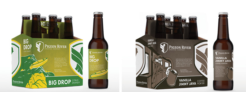
“We strayed away from artwork that was too wacky or colorful as that seems to send the message that the beer is going to be wacky, and that’s not what we were going for,” Knaack said. “There are plenty of packages on the shelf that are flashier and brighter than ours, but our beers have had great success in new markets partially because they seem more accessible, especially to transitional buyers.”
Knaack shared that a brewery looking to design — or redesign its packaging — should remember its target market throughout the whole process. From the development of the beers (in Pigeon River’s case: smooth, sessionable varieties), to the naming (for it, that meant nothing to “out there,” and often slightly humorous), to the design.
“Even elements such as how big the typeset is for the style of beer versus the name can make a big difference to potential customers,” Knaack said.
The designs for Pigeon River have gone through some minor changes over the years, but for the most part they’re the same as the originals Knaack added.
“It definitely took a lot longer to get our first few labels right because we were still trying to get the right vibe to come across,” she said. “Once we hit stride, it seemed like our subsequent labels came out a lot simpler just because we and our marketing team were on the same page as far as what we were going for.”
From the start, Knaack said they wanted all of the beers to somewhat fit together cohesively so eventually customers could easily pick out a Pigeon River six-pack — even if it had just come on the market, because it fit along with the rest of the line-up.
Also, the creative design aspect of the brewery’s six-packs are somewhat unique in the way they can be shelved in alternating directions like a brick wall and the images still line up.
The beer always comes first then the Pigeon River team brainstorms for the name. That means ownership, other employees, and the marketing team. The artwork is usually last.
“Some of our artwork also includes innuendo (along with the names), but usually it’s so subtle that most people wouldn’t pick up on it,” Knaack said. “We like it when customers can feel like they’re in on an inside joke when they ‘get’ the innuendo, but [we] don’t want to alienate anyone who wouldn’t appreciate our humor.”
Also, all of Pigeon River’s beer names have some sort of story behind them that relates back to the Knaacks, their employees, customers, or community.
An example, is the brewery’s IPA called Hop Offer. It happen to come out after Kayla and husband and fellow co-founder and owner, Nate had their fourth child in five years.
“I think part of the appeal of our labels is that they all go together so well,” Knaack said. “I am partial to our soda six-packs, which all feature a cartoonized, younger and slimmer version of Nate himself with an old-fashioned soda jerk’s hat.
“They really seemed to capture Nate’s happy-go-lucky personality. The Hop Offer also features Nate’s big smile.”


Be the first to comment