


Starting a brewery is tough. Sometimes the local hype can combine with the quality liquid and perhaps a killer taproom can sustain business. Eventually, branding and marketing will be a key and many newer breweries have latched on to those ideas quickly.
Having a standout look to packaging and in branding with logos that can tell a story are just as important in making a sale at the beer inside the packaging.
“Much of the research shows that people buy with their eyes when they look at a shelf set,” said Chris Smith of The Virginia Beer Company. “We keep our design simple and we echo the same features across all of our brands so they are noticeable and easily grouped in the mind of the consumer.”
VBC decided to go with the look it chose because it had a vintage feel, which matches the look and feel of the building (a 1960s era auto body shop) that the brewery is located in.
“We like clean lines and simplicity in general, both of which are reflected in our design,” Smith said.
The outline of the brewery’s logo is the hull of the Chesapeake Bay Deadrise, which is the state boat of Virginia. The arc of the word Virginia echoes the arc of the Crim Dell Bridge on the campus of The College of William and Mary in Williamsburg.
“Robby (my co-founder) and I met at William & Mary and started drinking craft beer together there, so the bridge has personal significance for both of us,” Smith said.
The two initially came up with design elements that were of interest to them in the branding of the brewery. From there they shared those ideas with four designers (two were friends, a third was a professional and the final one is now the current graphic designer for the brewery) and they all came to the table with different drafts.
“Each successive designer helped get us closer to the final product. It took many, many revisions,” Smith said.
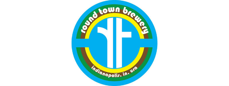 Because it has not yet begun to utilize the canning line, at this point Indianapolis’ Round Town Brewery has more of a brand identity than actual packaging in the literal sense.
“The original ideology that shaped our brand was and is our love for Indianapolis,” said owner and CEO Max Schenk. “Indy is known as the Circle City, which is how we arrived at the name “Round Town.” We also liked the play on words of buying a “round” of beer, and of course, our kitschy little saying, ‘no squares allowed,’ ”
Schenk feels that branding is extremely important with so many breweries competing for draft lines and consumers.
“We are confident that once someone has ordered one of our beers they will want a second based on the quality of the product, but the brand plays a large part in encouraging patrons to order that first beer,” she said.
In the early days the Round Town crew had all kinds of complicated ideas regarding what the brewery’s logo should look like. After taking the ideas to a few different graphic artists, the person most enveloped in the beer scene brought some of her own ideas, which Schenk said were certainly a departure from what they had been thinking.
“But we fell in love with what she brought us and we pretty much knew it when we saw it,” she said.
The one thing they had brought to her that remained a part of the final product was the color scheme. Head brewer Jerry Sutherlin’s brewing style is very keep-it-simple and true to style, Schenk said.
“For the most part, only the four ingredients which constitute beer are what make it into his brews: water, hops, yeast, and malt. Based on that, we liked blue, green, yellow, and brown for a color scheme,” Schenk said. “Our artist (Casey Parmerlee) was able to give us a clean logo with a nod to Indy and our name right in the center, surrounded by our four theme colors. She is now a full time employee with us and handles our marketing, social media, and continues to help shape our brand identity through all of these platforms.”
1 Trackback / Pingback