


With the opening of its second production facility this fall, Monday Night Brewing decided it was time to take a look at its entire portfolio to see how the beers coming out of what they call “the Garage” will fit into the market.
After weighing many different options the brewery announced a redesign, including two new core beers and a complete overhaul of packaging.
Brewer spoke with co-founder and CMO Jonathan Baker about the changes, which will debut in a few weeks.
“I wish we had the resources to do more formal research, but we didn’t, so we had to shoestring it,” Baker admitted. He said that a poll of employees came first.
“They live the brand day-in and day-out to varying levels, and they actually had quite a bit of really helpful ideas and feedback,” Baker said. From there, MNB utilized SurveyMonkey to get an idea for where its current branding was lacking and where the real opportunities were.
“We pushed it out to our social media followers and posted it on our website to get some good responses,” he said, indicating that most of this discussions and changes have happened over the last four months or so.
“We had a pretty aggressive internal timeline. I would say that’s probably not typical,” he said. “It took us about 2 months to figure out what direction to go, and another month to really sharpen that concept and finalize designs, and another month to get all of the new packaging supplies and marketing materials done.
“If we had been working with an agency it would have been longer, but since we did all the work in-house, we had the luxury of pushing things forward quickly.”
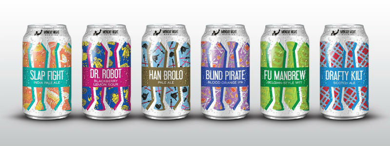
The brewery will also release two new beers to the core lineup, including a Pale Ale and a Blackberry Lemon Sour. These two beers, along with seasonals and specialties will be moved to 12-ounce cans with most coming in six-packs while specialties will be made as a four-pack.
Monday Night has had the same packaging for almost six years, and Baker and his staff admitted although it has served them well, it hasn’t been as versatile as they’d like, given the current craft beer environment.
The new packaging will accentuate the necktie, which has always been a core part of who what the brewery is about.
“The necktie symbolizes our journey from white collar to blue collar, where we realized it’s more important to love what you do than to be paid well for something you don’t enjoy,” the brewery said in a newsletter. “We will also use a predominantly white background with bold colors and patterns to distinguish individual beers. This new direction keeps our core identity, but allows us to be a bit more free and playful with new designs and beers moving forward.”
When it comes to standing out, Bakers think the main thing that mattered to the staff was keeping it simple.
“There are so many great beer labels out there, all with different styles and philosophies behind the art. I believe you have just a fraction of a second with the typical consumer scanning the shelf, so you can really only get one message across,” he said. “For us, that’s the necktie. The necktie is the prologue into our story, so it opens up a conversation. It’s very easy to over communicate with a beer label, so it’s important to always keep in mind the context. Is this beer going to be one of thousands at a specialty bottle shop? Or are you targeting more of a “billboard” approach in the grocery aisle?
Baker believes ‘a beer label should have soul.’
“These are really personal products, hand-crafted for varying tastes and usually not distributed widely,” he explained. “The label should invoke the personality of the brewery itself. The beer style is probably second on my list, and one of my pet peeves when shopping for beers. I want to know what style of beer I’m looking at almost immediately.”
1 Trackback / Pingback