These days more than ever, Lupulin Brewing‘s Marcus Paulsen feels that eye-catching and fun-to-look-at label art is critical.
”There is a ton of competition out there and a lot of breweries putting out some really cool stuff,” said the Marketing & Artistic Director of the Big Lake, Minnesota brewery. “The can needs to scream in your face ‘pick me up!’ and then if they like the liquid, they’ll come back.
”I think our labels have been a big part of our success.”
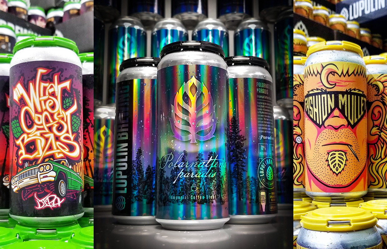
The brewery recently picked up three “Crushies” at the 2021 Craft Beer Marketing Awards for can and packaging designs, including a platinum award for Polarnattens paradis.
Polarnattens paradis was a redesign of an existing brand — previously in 12oz cans and before that in bottles — now put in 16oz cans and released for the first time in December, 2020 while West Coast Bias was released in June 2020 and Fashion Mullet — which has become one of the brewery’s core beers — was released in cans for the first time in April of 2020.
READ MORE: Canning Your Brands: Shrink Wraps & Sticker Labels
Paulsen, who has been the designer for labels since the brewery’s inception, said part of the philosophy on label artwork is twofold.
“So one part is the label has to look rad, but the other part that we are learning right now is absolutely critical, is brand recognition,” he said. “Our hop cone logo is our “Nike Swoosh,” and we’re finally at the point where people are noticing it and associating it with our product. It’s something I’ve hoped would happen from the beginning, so I’m pretty stoked that it’s working!”
Paulsen said they have found that the labels with that logo front and center — Polarnattens paradis for example — are selling better than those without it.
“The majority of our core beers feature this same label layout,” he said. “However, labels like Fashion Mullet and West Coast Bias arguably are still recognizable, just due to them being my own personal hand-drawn style.”
Paulsen said his style for the brand is done to keep it relatively consistent and develop a brand language that people can recognize quickly.
The brewery started with shrink sleeves but eventually transitioned to labels, which allows Lupulin to explore many more creative print techniques, materials, decorations, textures, and such.
“And really, [it] just gives me more options of ways to make our labels stand out,” Paulsen said.
The majority of the labels are hand-drawn on an iPad Pro, in an app called Procreate, using an Apple Pencil. From there Paulsen will export a file and bring it into Adobe Photoshop on a PC for some final tweaking, and finally into Adobe Illustrator to bring it all together and export print files.
”Fashion Mullet and West Coast Bias were both created this way,” he said. “However some labels are created entirely in Photoshop and Illustrator, with no hand-drawn elements — Polarnattens paradis for example.
”If I have the time, I always prefer to draw them by hand.”
So where does the inspiration come from? And what influences the direction of the art and design or packaging thoughts?
”That’s the million-dollar questions,” Paulsen told Brewer. “Aliens maybe? Late nights, recreational herbal medications, brainstorm sessions with the crew here at the brewery … there isn’t really one set way I do it. Sometimes the brewers will have something specific in mind, but often it’s just staring at that blank canvas long enough for inspiration to strike.”
He did note that if there’s a special ingredient or process involved with the beer he’ll always try to capture that in the artwork, whether it be with literal depictions of adjuncts, or just colors that fit and make sense for the liquid.
”Inevitably I’m inspired by other breweries/artists, but I really try to make our stuff look unique,” he said.


Be the first to comment