


Over the past 18 months, Cape May Brewing Company engaged in an extensive brand redesign effort, contracting with Austin-based Canales & Co. The result, unveiled during Memorial Day weekend, has been extraordinarily well-received said Marketing Manager Alicia Grasso.
“Our new look evokes a refreshing, relaxed feeling — like a cold beer on a hot day,” she said.
The new look is based on what Cape May — located in southern New Jersey — represents as a beach community. Canales & Co. created a logo that feels windswept — like a breezy day on the beach, with the wind flapping at umbrellas and seagulls flying overhead.
“We really wanted to find something that said Cape May,” Grasso said. “Our community has come to embrace us over the past six years, and we realized that Cape May’s laid back beach culture has been a huge influence on what our brand has become. We wanted the redesign to reflect that.”
The new designs provide CMBC with a cohesive look across multiple platforms, including a revamped website (which was the original plan) and new bottle designs. (Read More: The 3 Things Cape May Brewing Discovered During Re-Branding)
When mounting a redesign, it’s of the utmost importance to take a step back and really define your company, Grasso noted.
“Who are we? Why are we here? What do we stand for? Where do we want to be in five years? They’re important, difficult questions,” she said “When we wanted to redesign our website, we found that many designers had these exact questions for us, and we didn’t have the answers.
However, we felt that, as we expand, a cohesive look was necessary to draw new customers. Our die-hard fans nearly always keep in contact with us, are always aware of new releases and the goings-on within the company, and are with us every step of the way.
“However, as we open new territories, we realized that we couldn’t just be the rebellious upstart anymore — we needed to have a personality that goes beyond that, into something that really spoke to who we are.”
When CMBC was started six years ago, the logo was designed by the sister of one of the co-owners. Since then, the logo and overall look of the brand has been somewhat of an evolution, with elements of the logo added and embellished throughout the years.
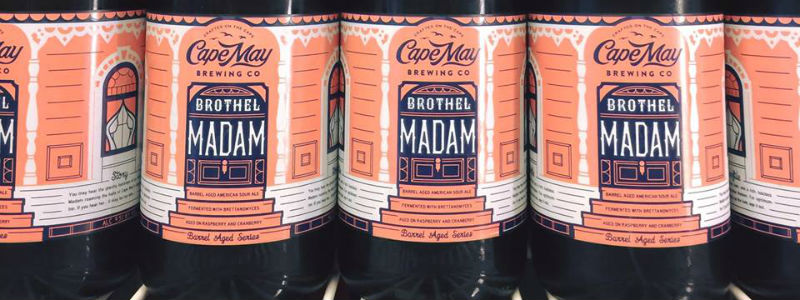
The bottle designs were essentially one-off designs with no real connection to each other or to the brand. On the shelf, it was nearly impossible to determine that Cape May IPA and Coastal Evacuation were brewed by the same company. Grasso said that they wanted the brand to have a cohesive look and feel.
“Our fans will be able to instantly recognize CMBC’s packages in the retail environment through our new, unified design,” Grasso said. “One of the most important aspects of our redesign was that we communicate to our fans that the company has not changed in any way. They’ll still be getting the same product from the same company. Our story itself hasn’t changed. We just grew up a bit.”
The previous logo— among other things, comprised of the state of New Jersey with a star at the tip to represent Cape May — engendered quite a bit of New Jersey pride to its fans.
“We realized that was something we couldn’t leave behind,” Grasso said. “While the new logo doesn’t specifically reference New Jersey, we have an icon on our website and on every bottle that says ‘New Jersey Proud.’ Our story hasn’t changed. We just found a way to express it a little better.”
The most important aspect of any redesign goes well beyond the design itself — it needs to be communicated to fans with a great deal of care.
“Once the finishing touches were being placed on the design itself, we spent nearly a month crafting our message and deciding exactly how we were going to inform our fans of the change,” Grasso said. “The roll-out involved quite a bit more than simply saying, “Hey! We look like this, now!” Our fans have given us their hearts and souls, and it’s a tremendous responsibility not to trample all over them. We understood that we needed to do it in such a way that spoke to and respected our fan base.”
Grasso said the company achieved that through good old direct honesty.
“When we started, we didn’t know who we were,” she said. “We knew that we wanted to make good beer and get as many people as possible to drink it. We’re so much more than that, now. Now, we know what we stand for and why we exist as a company. The community has embraced us, and we embrace them back.”
Most of the response to the redesign has been positive. There have been a few naysayers, but Grasso said that’s to be expected.
“Some of the most gratifying responses have come from those whose minds we’ve changed through the message: ‘You know, when I first saw the new logo, I hated it. But once I read why and had it explained to me, you sold me.’
“That’s how you maintain loyalty: by treating your fan base as people with feelings who care about you. Without them, you might as well still be homebrewing.”
Be the first to comment