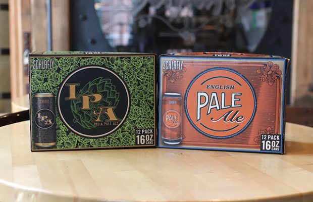
When Schlafly Beer announced earlier this year it would be releasing new packaging for its beer throughout 2019, this was with the purpose of continuing innovation for the 28-year-old brewery.
Staying true to style, Schlafly’s packaging now shows a circle in the center of the packaging featuring the beer’s style and a corresponding color, rather than a cream circle with the Schlafly logo. This helps consumers make accurate decisions based on a style of beer, featured in the packaging which exemplifies the ingredients and story of the beer.
Boulder Beer, in Boulder, Colorado, refreshed its brand in 2018 in an attempt to continue to allow individual brand identities shine, especially when it’s so critical to stay fresh in this competitive beer scene.
After meeting with several design firms, Boulder Beer went with Moxie Sozo for their energy and creativity, as well as their success designing for other craft brewers.
Boulder Beer is just trying to keep up with demand.
“We’ve retired a few legacy beers throughout the years, and have reworked our logo and label designs multiple times,” said Tess McFadden, Director of Marketing at Boulder Beer Company in a press release. “People’s palates change and evolve, as do design styles and trends.”
The graphics on the cans should represent that continued evolution.
2018 also saw Pike Brewing redo its packaging for Pike Space Needle IPA. The can features a star with an interlooped “P” in the middle. It was market tested on 22-oz bottles before being put on Pike’s 12-oz cans. The logo was used on several other beers as well, bringing back Pike’s retro roots.
The star and font were recognizable to old fans, which has been on the beer labels since 1989. The updated packaging was an attempt to modernize, with a nod back to old traditions and Pike history.


Be the first to comment