


Breweries that have grown to a certain size and model are looking for ways to to adapt and find some middle ground to compete in a market where small batches and sales in a taproom have become key for smaller breweries.
Meanwhile, a brewery like Rivertowne Brewing, which opened in 2007 and is expected to produce 10,000 barrels in 2018, is looking to align with a market concept it started with and continues to grow.
“We have some beers planned which will be limited to sales from our tasting room, but we are still inspired to compete and have a larger presence,” explained Rob Johnson the VP of Sales & Marketing for Rivertowne. “It’s what we were built for, and frankly, we feel that we have a responsibility as the largest volume producing brewery in Pittsburgh to lead by example and provide inspiration to smaller breweries who might have similar aspirations.”
Starting on April 2, the brewery will debut its brand refresh along with a new stock of beers focused on today’s consumer, including a whole new line of IPAs.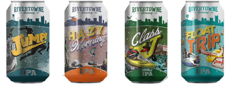
“Branding refreshes are routine processes for many breweries and companies in other fields,” Johnson said. “Wylie the fish served us well for the first 10 years of our existence, but it became evident that it was time for a change.”
The direction of the new branding really came from a question Johnson said that the company asked themselves.
“What activities do we enjoy in our spare time? Swimming, kayaking, camping, fishing, and sipping suds on our boats are the activities that came to mind,” he explained. “These activities led us in the direction of river recreation for our updated branding as we feel that these are activities enjoyed by many folks who reside in river communities here in Pittsburgh, Pennsylvania and across many other states.”
The new direction is designed to focus on the longtime company mantra of “My Rivertowne” and capture the essence of river communities throughout the country where leisurely outdoor activities take center stage. In the new brand direction, Wylie’s image has been replaced with graphics designed by local artist Gian Romagnoli that emphasize outdoor recreation.
Johnson noted that the brewery had a “glaring hole” in the IPA category with Old Wylie’s IPA being a hybrid of a American and English IPA.
“The beer felt dated and lacked the pop and familiar flavors of a modern American IPA,” Johnson said.
So the brewery is releasing Jump!, a Mosaic IPA along with a hop-forward Pale Ale, Float Trip.
The addition of Hazy Morning, a NEIPA, and Class V, a Double IPA rounds out the quartet and gives the brewery a chance to add a new package with a ‘Dock Party IPA Mix Pack’ to shelves as well.
“IPA drinkers like variety, so we wanted to offer these drinkers a 12-pack with three cans of each of these unique IPAs,” Johnson said.
The brewery worked at drying up most of the old imagery merchandise and packaging the best that they could, but some remains.
“There will be many folks who would like to get their hands on merch with the previous imagery as keepsakes,” Johnson pointed out. “We will have a lot of 12 pack cartons to recycle from the previous branding.”
Be the first to comment