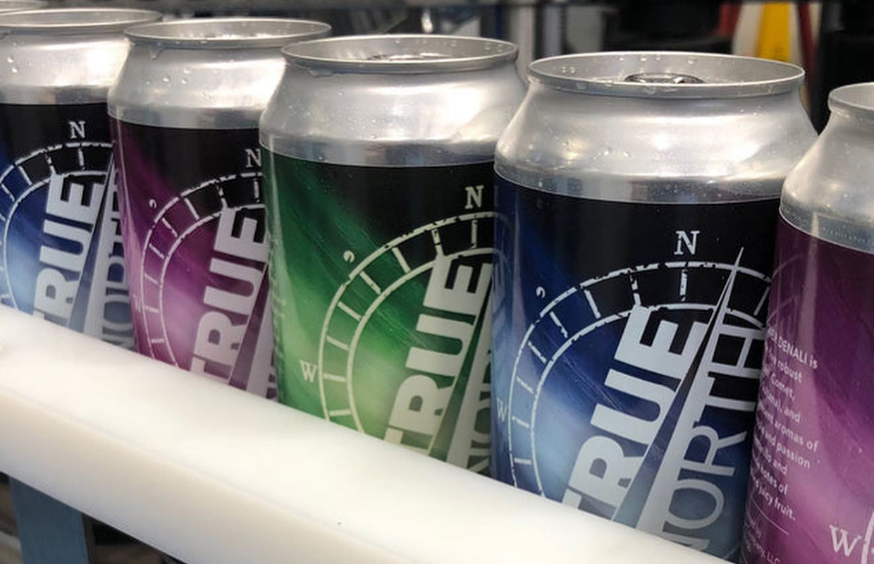
Although ‘A Comet Over Denali’ may be a delicious West Coast IPA from True North Ale, it’s the thought process behind the packaging that helps make it stand out on shelves and Gary Rogers agrees.
Using the same comet streaking through the sky past a mountain range, the Comet brand is sold in three different colors, but as a four-pack. That means every grouping has two of the same color each time and makes for a great display on shelves to attract consumer attention.
“We were going to goof on people and say if they buy the four pack, they need to find the fourth color,” he said with a laugh. The labels are in blue, purple and green. “That might get people going out trying to buy more beer, but, you know, we decided not to do that.”
Rogers said they were approached by their label designer and they gave some ideas. Being able to run the colors in succession and then canning them with pressure-sensitive labels off a roll gave them this option.
“To be able to have every third label a different color, It really pops when it’s on the shelf,” said Rogers, who is co-founder and Chief of Business Operations for the Boston-area brewery.
Now, let’s get to the liquid. It’s the beer inside is what is what keeps people coming back, Rogers said. The beer was released on November 1.
“It’s a damn good beer,” he said. “In New England, hazy/juicy IPAs are still king. But people are looking for something that’s a little different. We brought out an Extra Pale Ale recently in the taproom and it’s right up there with the hazy/juicies as far as taproom sales.
”We expect that it’s really going to go well.”
Starting as a part of its in-house IPA program, True North ramped up production of Comet after a successful sales run about 18 months ago. Seeing how its Kestrel IPA did with three different labels of the bird to help raise funds locally for its Audubon Society chapters, Kestrel helped lead to the decision to do Comet the same way, but instead of different labels, just color tweaks to give a bold presentation.
“We were saying after Kestrel — because most of what we were doing were hazy/juicies for a couple of years — we should bring back Comet,” Rogers said. “That’s a true West Coast IPA, it’s not overly bitter, like things were back 5-7 years ago.
“It really is a really nice flavor profile and (Brewer Seth Barnum) really brought that out.”
Even if popularity rises, Rogers doesn’t believe this would be a printed-can situation.
“The biggest thing that our production team tells me is that if we went with printed cans, instead of just brites, we’d have to pull apart the depalletizer every time and put in a new label,” Rogers said why it’s easier to use pressure-sensitive labels on this project. “It would be a huge pain in the ass. So we’ve avoided that. If you just put another roll of adhesive labels on, that’s a lot easier.”


