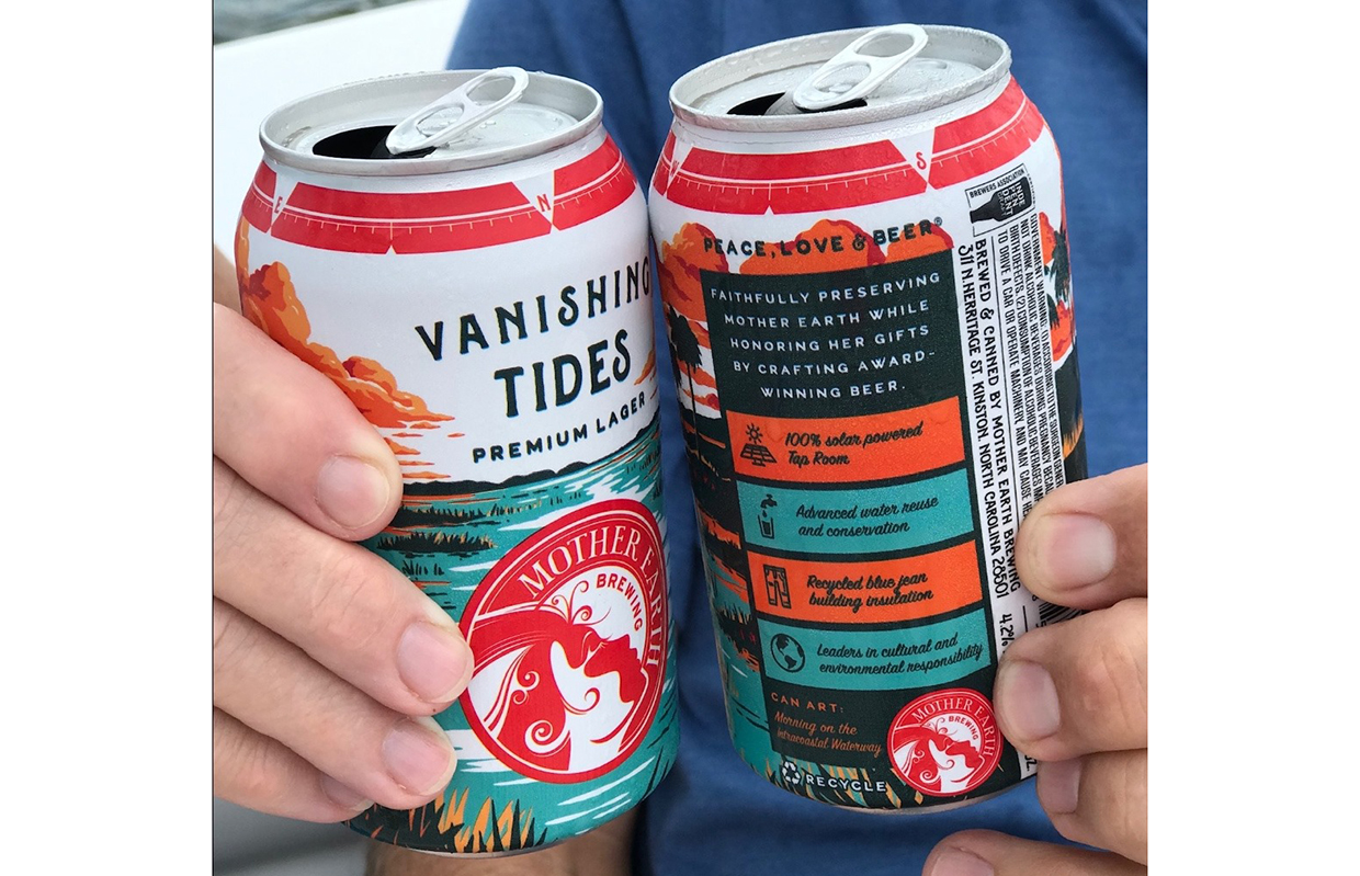
Being “local” wasn’t good enough to generate sales for North Carolina’s Mother Earth Brewing anymore. When the Kinston, NC-based facility opened in 2009, having cans on the shelves as far away as Charlotte and Asheville was still local enough for people to purchase. Can art was “all over the place” according to Director of Marketing, Nicole A. B. Edwards.
“Now ‘local’ only applies to a 50-mile radius,” she said. “After a few years of feeling like our can art was all over the place, we felt it was time to revisit the design and streamline our product portfolio with a cohesive look.”
Internally, the brewery reviewed hundreds of brands in the market to get an idea of what they liked, what they didn’t like, and how they could stand out.
“The packaging redesign was key to staying relevant and standing out against the seemingly unlimited options on the shelf,” Edwards told Brewer. “Our name is Mother Earth. Our founding principles are built on the concept of sustainability. But none of that was seen on our cans or our boxes.”
They took that information to Ebbing Branding + Design and did an even deeper dive into its brand values, and it all came together from there.
READ MORE: Is Your Branding Built to be a ‘Elevator Pitch Haiku’ to Consumers?
“Now, we have direct depictions of Mother Earth with stunning landscapes, complete with a human element that represents how we can coexist with nature without harming it,” Edwards explained. “We also showcase some of our pillars in the copy on the back of the cans so consumers can read about our commitment to civic responsibility and environmental stewardship.”
The new direction for the brewery’s branding came from a series of conversations between its team and Ebbing’s about core values and communicating that to customers.
“They did what they do best, which was to help bring our vision to life,” Edwards said. “We’ve always been known for producing great craft beer, but we wanted to tell the story of our company that goes so much deeper than that. Ebbing helped bring all that to the surface.”
Edwards said the logo that the brewery has had from the start could not go.
“We were very adamant that our logo didn’t change because we wanted to keep that element the same for brand recognition purposes,” she said. “Plus, we all love our logo and are told by folks all the time how cool it is.”
That actually helped cut some costs since the logo stayed the same, which meant most brewery-branded merchandise could stay. The biggest switch was the packaging. The brewery originally had the strategy to deplete all its product in the market before launching the new packaging, but COVID hit right around the time of the launch.
“[It] threw everything off course as on-premise options tanked and off-premise demand spiked,” Edwards said. “We ended up having new product next to the old product on shelves for a short time and it may have cannibalized some sales, but ultimately we had such a great response to the new packaging that we were happy to get it out there as quickly as possible.”
Communicating the switch led to an increase of focus on social media.
“Even just a few years ago, our social media presence was sporadic,” Edwards admitted. “Now, we make an effort to post consistently, feature a balance of product shots and behind-the-scenes looks, and engage with our customers since so many of them can be found in the social space.”


Be the first to comment