In an ongoing series, Brewer will take a small note from interviews of some of the cover stories it has run and give a small tidbit that didn’t make the issue, but is still worth diving into.
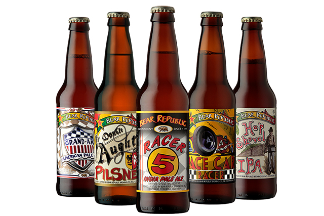
Bear Republic’s logo hasn’t changed much. Well, not drastically, anyway.
Ricardo Norgrove — a co-founder of Bear Republic and the son of fellow co-founder Richard Norgrove — has been the fuel behind the artistic director the brewery took when it opened in the mid 90s.
“My dad from Day 1 has always gotten kind of like a double whammy with having me as the Brewmaster and then also as the artist,” Norgrove joked during his interview with Brewer for the July/August 2019 issue.
As a family-owned legacy brewery change has been adaptive, from styles to look.
Norgrove explained as new brands came out, the artwork was directed toward that brand. But over time, that began to look messy and getting a more centralized look to the family of brands was ideal. So Norgrove started BIRD: the “Brand Identity Refresh Directive” in an effort to try to make sure that Bear Republic had consistent looks.
“We used to use a banner with the red, yellow, green — kind of Rasta stripe — on the top of our labels for years and we recognized that we had an inconsistency in the market,” he said. “It’s kind of funny but my dad pushed me about seven years ago to try to have a consistent look. So we went away from the original Racer look. The red/yellow/green on the Bear Republic.”
So, he got to work and there was only one label that Ricardo needed to change: Racer 5, the brewery’s flagship IPA.
“Then the BA came out with this whole Independent movement,” he recalled. “The original labels for Bear Republic had “Independent since 1995” and we’ve had those on our labels since Day 1.
“I had moved away from that, I was completely done except for changing Racer 5. Then my dad, who’s president at the time was like, ‘Hey son. We we need to go back to this.'”
That’s when BIRD was started and now Bear Republic has a consistent look.
“It’s now about that “Independent since 1995″ with the with the iconic California bear in the middle,” Norgrove said. “That’s been a really big change for us to actually do that. So it’s happened over time. And not everybody has recognized the change.”


1 Trackback / Pingback