
High Limb Cider spent the first half of this year defining its brand so redesigning the labels was an exciting way to start bringing that new brand to life.
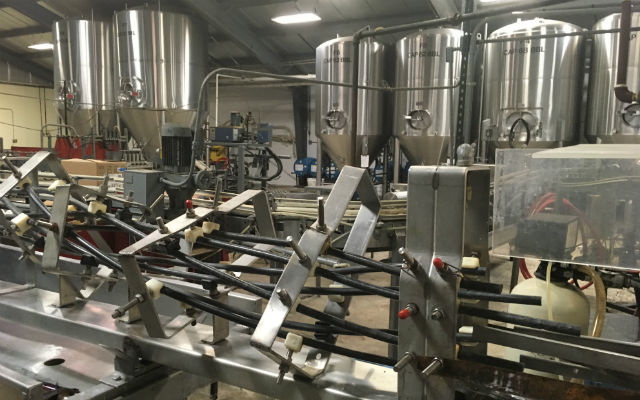
“We are releasing new packaging this Fall to compliment our brand’s growth,” explained High Limb VP of Marketing, Mary Kate Byrne. “We’re releasing a lot of new products, refining recipes, and processes for some existing products, and launching our taproom inside our brand new facility in Plymouth, Massachusetts.”
A switch for Swilled Dog Hard Cider was needed as well, said co-founder Brooke Glover.
“We’ve made our labels more engaging and made sure they really stand out on the shelf,” she said. “We’ve also doubled down on keeping information on the can about our charitable giving.”
High Limb’s portfolio includes four unique Series, each with particular offerings.
“We wanted to build a system that allowed for each series to have distinctive label design while still feeling like a cohesive brand,” Byrne said
That meant considering two factors in the label look.
- Authentically represented: “Our goal is to build a brand, not just sell a product,” Byrne said. “So every seemingly small decision needs to be part of that larger plan. Consistency and authenticity with our branding is key.”
- Will it stand out on the shelf?: “Most of our sales are at retail and the shelves are crowded,” she added. “When so many other products are being loud on the shelf, sometimes the best way to get attention is to take a quieter approach.”
High Limb started out with the idea that all of its labels would riff off of a common theme and be very complex, but Byrne said they have learned that flexibility is necessary because of label development costs and varying consumer comprehension.
“Different products require different signaling to consumers,” she noted. “Some labels we have left [to be] complex because communicating the narrative is crucial to their understanding of the taste profile.
“Some labels we have whittled down to basic messaging to save money, or so that the consumer instantly knows what they are getting.”