The thought of rebranding your cidery’s packaging lineup comes with an uncomfortable question: If the product is already working, why risk changing how it’s presented?
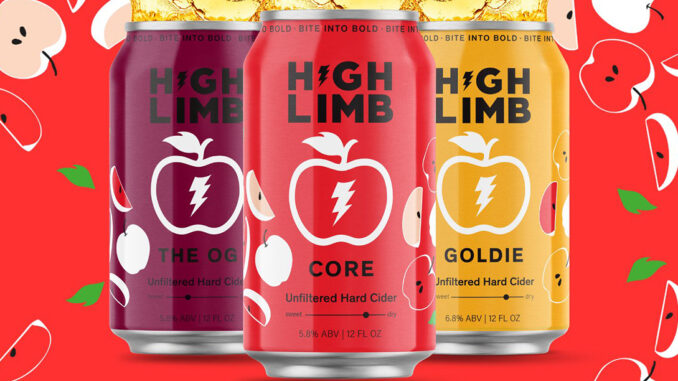
That’s the dilemma High Limb Cider wrestled with before unveiling a refreshed visual identity this year. The Massachusetts cidery wasn’t trying to reinvent its cider. It had already built award-winning products and growing distribution. Instead, founder Jeremy Quaglia said the greater risk became allowing the brand’s presentation to fall behind the business itself.
“In today’s market, if it’s not broke, don’t fix it is a pretty good way of continuing a business,” Quaglia said. “I think it was just time to show what the brand was more about in the physical sense.”
For other cideries considering a refresh, Quaglia highlighted in a recent Cider Business podcast that rebranding isn’t about chasing trends. It’s about making sure packaging communicates as effectively as the liquid inside.
“The product needs to be as engaging visually as it is tasting,” he said. “The brand needs to look like how it feels and tastes.”
That realization didn’t happen overnight. What originally differentiated High Limb eventually became commonplace. When its original cans debuted, it was clean, minimalist designs that stood apart from crowded shelves filled with loud graphics. Years later, retailers began telling a different story.
“We started talking to them, and what we would notice is a lot of people were starting to do clean, modern and crisp,” Quaglia said. “That actually didn’t stand out in the market anymore.”
Rather than relying on internal opinions, High Limb leaned heavily on its retailers, who ultimately became some of the company’s most valuable advisors during the process.
“These guys eat, sleep and breathe retail all day, every day,” Quaglia said. “They know what works, they know what doesn’t.”
Looking back, he said he wishes those conversations had started even sooner.
“I probably would have spent a lot more time with retailers,” Quaglia said. “They’re telling you stuff, and you’re either choosing to listen or willingly being like, ‘Yeah, but what I do is really good because I do it.'”
That willingness to listen became one of the biggest lessons from the entire project. Instead of designing packaging around personal taste, High Limb repeatedly tested concepts with the people responsible for selling cider every day.
“We would print out printer-paper wraps on the cans and go to retailers and ask, ‘Do you like this one or this one, and why?'” Quaglia said. “Honestly, the feedback was almost always different than what we thought would work.”
For Quaglia, that’s where many beverage companies make their biggest mistake.
“Don’t design to your taste,” he said. “Just because you think it looks good doesn’t mean the market might reciprocate that passion toward it.”
The same customer-first thinking extended beyond graphics. High Limb also reevaluated package formats after hearing repeated feedback that consumers increasingly preferred 12-ounce cans over 16-ounce offerings because they felt like less of a commitment.
Quaglia said that branding isn’t simply about aesthetics. Every element should make the product easier to understand.

“If a consumer can understand the product, they typically buy it,” he said. “Loyalty is really difficult. If they can understand it, they tend to gravitate toward it a lot more.”
That thinking also influenced one of the team’s biggest concerns entering the redesign: protecting existing customers while attracting new ones.
The company deliberately enlarged its logo to create what Quaglia described as a “billboard effect” so longtime fans could quickly recognize the brand, even with updated artwork.
“We’re trying to attract new audiences and new cider drinkers,” he said. “But it’s a big signal that this is the product you know and love.”
For owners wondering whether they’re overdue for a refresh, Quaglia believes the answer often comes from outside the building rather than inside it. Market conditions evolve faster than many brands realize, and packaging that once stood out can slowly blend into the background.
“I think brands have to reevaluate that every three or four years,” he said. “People are kind of afraid of it because they get used to it. That’s their baby.”
READ MORE: How to Rethink Cider Branding Without The Apple
He also believes humility plays a significant role in successful rebranding. High Limb quickly realized the project required expertise beyond what the internal team could provide, leading the company to partner with a professional branding agency.
“You have to understand ‘I’m not the best at this,’” Quaglia said. “It’s so nice to be able to pick up the phone and have someone whose expertise is way above yours.”
That outside perspective extended beyond package design. Quaglia said learning the psychology behind branding — understanding why every design choice influences purchasing behavior — became one of the most valuable takeaways from the process.
If a complete rebrand isn’t financially realistic, Quaglia recommends focusing first on the assets consumers interact with most often. Strong product photography, consistent branding and authentic messaging across social media can help bridge the gap until larger investments become possible.
“A lot of people look at social and forward-facing brand elements as an after-the-fact thing,” he said. “If you can make your social, your photography and everything feel like how you feel about the product, people will understand it and gravitate toward it.”
For High Limb, refreshing the brand wasn’t about changing who the company was. It was about making sure consumers could see it as clearly as the founders already did. That’s a distinction other cideries may find increasingly important as shelves become more competitive and first impressions carry more weight than ever.