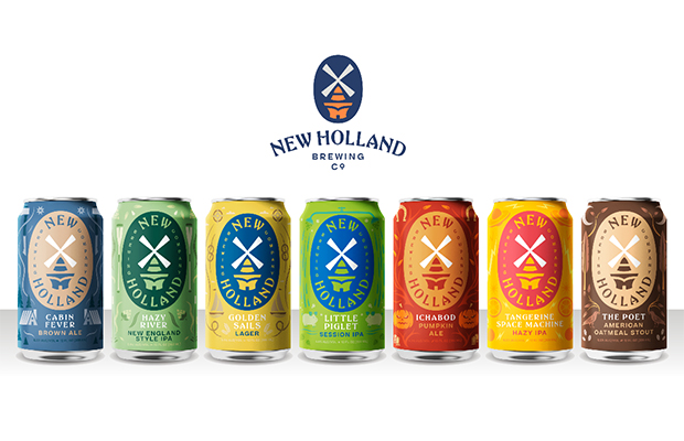
New Holland Brewing Company has proudly reintroduced itself to supporters with branding that recaptures the spirit of their vision.
The rebrand concentrates on offering something special for everyone by being innovative, welcoming and resourceful. These principles are anchored by the Dutch word “Gezellig,” an all encompassing feeling that spans from cozy to friendly, relaxing to comfortable, enjoyable to gregarious. More a state of mind than a specific image, Brand Manager Adam Dickerson explains how the Gezellig lifestyle applies to New Holland.
“At the heart of who we are, New Holland is here to inspire joy and create moments worth remembering with the people you care most about,” Dickerson said. “Our role in that is to be that beverage on the table that brings people together—the centerpiece to those moments.”
Visually, the updated windmill logo leads as a focal point for the branding. Redesigned to look both contemporary and classic, the soft lines and vibrant color palette create a logo that’s built to last. It refocuses on New Holland’s Dutch heritage while paving the way forward for innovation.
“That windmill is a symbol of our roots in Dutch culture,” Dickerson said. “But I think what we’ve done with the windmill now is clean, it’s fresh, it feels much more iconic than ever, and that’s our idea—to modernize that Dutch culture.”
Fans will discover the logo front and center on the overhauled packaging, marking an important departure from New Holland’s previous design. From Ichabod’s Horseman to The Poet’s Raven, New Holland has amassed a stable of seminal imagery. The new cans honor the ethos of these brands while uniting the beers under a consistent art style with fun and friendly illustration that make the products both appealing and immediately recognizable.
While much of the core lineup remains, New Holland has invited a few new year-round offerings to the fold. This includes Hazy River, a 100% Citra-hopped, ultra-cloudy New England Style IPA with bright, hop-driven flavors of pineapple, mango and citrus.
Then there’s Little Piglet, a new Session IPA that brings fresh hop cone bitterness at a crushable 4.7% ABV to the portfolio. As for the name, Little Piglet is an ode to the Dutch expression, “I’ll wash that little piglet!” meaning to get the job done. It surely will.
Lastly, welcome Golden Sails, a clean, crisp lager that pairs well with just about any outdoor activity. Expect the new packaging to hit distribution this August/September in six-packs and twelve-packs.
This repositioning for the future has given New Holland’s owner Brett VanderKamp time to take a look at the brewery’s past.
“When I opened the brewery here in Holland there really wasn’t a social drinking culture,” VanderKamp said. “Now you walk 8th street and there’s public houses and establishments that welcome all walks of life and families. It’s really created a nice sense of community and we feel really proud to have helped pioneer that here.”
Think of it as “New Midwest Dutch”—providing joy through moments of togetherness. At New Holland, everyone is welcome and the new branding reinforces that warm hospitality. When visiting the Pub on 8th in Holland or the Knickerbocker in Grand Rapids, you’ll notice changes both subtle and overt that reflect that inviting identity. Ultimately though, as the company continues to evolve and prosper, one thing will always stay the same, when you see a New Holland sign you’ll know: this way to Gezellig times!


Be the first to comment