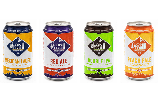
When Lone Tree Brewing refreshed the look of the brand a few years ago with the canned release of its awarding-winning Mexican Lager, it quickly became the southern Denver-area brewery’s best-selling beer.
“In every beer we develop to be distributed in package, the branding for each beer is straightforward and the consumer knows what is in the can before ever opening it.,” said Dennis Stack, Director of Sales and Marketing at Lone Tree.
“Branding helps create a recognizable image that allows us to grow within a region using the brand itself.”
At a time when there are well over 7,000 craft breweries in the US, it’s incredibly important to have a strong brand and visual identity said Angel City‘s Jennifer Henry. For Angel City’s latest beer launch, L.A. Blonde, the Los Angeles-based brewery tied its can design and colors into a relationship it has with the LAFC soccer club and its primary colors of black and gold.
“We live in a time where you can’t just brew great beer because there is a lot of other breweries doing just that,” she said. “You need to be able to stand out on a shelf, in a bar, anywhere that beer drinkers need to make a choice on what they want to drink.
“There’s a lot of competition out there and it’s more important than ever to stand out.”
Snake River Brewing recently rebranded for its 25th anniversary. Luke Bauer said much of the Wyoming brand’s identity is centered around the unique geography near the headwaters of the Snake River and the largest relatively intact ecosystem in the lower 48 — The Greater Yellowstone Ecosystem.
“So it’s important to us that our staff’s experiences in the Tetons, Yellowstone, and the other wonderful lands that surround us are communicated to our customers through our packaging choices,” said Bauer, the brewery’s Sales & Marketing Director. “We use unique, custom created art from artists in Wyoming and adjoining states — people that live in the same places we do.
“We think it’s important to update packages as technology changes so any time a canning line is updated, a new polymer coating comes out, or sticker technologies change, it’s time to take a look at what message our can is sending too.”
Bozeman Brewing‘s label art was chosen with dramatically contrasting colors from one label to the next to differentiate instantly upon sight explained brewery president Todd Scott.
”We also choose to enlist as much local lingo as possible: Bozone, Gallatin, Pinhead,” he said. “I think it helps as Bozone is THE Bozeman beer.”


1 Trackback / Pingback