


Differentiating your brand in the marketplace is tough. Ingenuity and the decision to make each beer standout versus establishing a family brand look can be some attributes to consider before designing can and bottle labels along with any other packaging.
“In our opinion, it’s the best way to differentiate yourself in the market,” said Fat Bottom Brewing‘s Marketing Project Manager, Sarah Archer. “The first priority for us is quality. Period. We take every opportunity we have, and devote the majority of our resources into making the highest quality liquid possible.
“We thought that should also extend into the aesthetic of our packaging, and the way it is presented in the market. So many breweries have incredible beer these days, and you have to find other ways to stand out in a saturated industry.”
For Fat Bottom, discussing this aspect was key. Archer said when the brewery discussed its brand as a whole, the “Americana” aesthetic seemed to resonate with consumers in the Nashville market.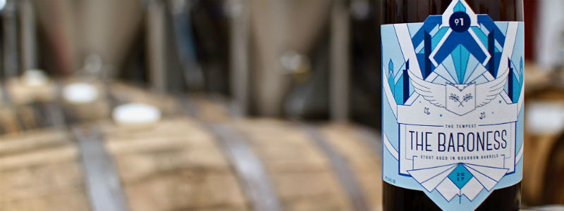
“The WWII-inspired pinup artwork adds a playful, yet tasteful, level of nostalgia,” she said. “Although we do incorporate a pinup design on many of our beers, we do so with the aim to bring awareness to “badass” women of history, and how they impact the work we do today.”
The artwork for the Fat Bottom core brands draws inspiration from the nose art of WWII fighter planes.
“It’s a classic look with modern twist,” Archer said. “The Tempest, which is a series of high-end recipes featuring sour and barrel-aged brews, is crafted with an art deco feel. Each individual beer we have is designed to tell the story of a strong, historical female character. Unique women such as Margaret Hamilton, Josephine Baker and Bertha Von Suttner are a few examples.”
Fat Bottom decided to hire out for the branding work to get a fresh perspective.
“It’s very easy to be too close to the work when you keep everything internal, and we thought this would be a great opportunity to tell the story of our beers with the voice of a branding industry professional,” Archer said. Located in Nashville, Proof Branding was the best fit for their situation, she added.
“Their attention to detail, artistic range and personal touch made the process very smooth, and yielded amazing results,” Archer said.
The brewery started with consumer research, including asking what details resonated with consumers among so many other craft beer brands.
“You have to be able to jump off the shelf in a large retailer and stand out on a crowded tap wall without actually interacting with the buyer,” Archer pointed out. “Our No. 1 priority is to brew a quality beer, so it makes sense to designate the necessary resources into our branding to help Fat Bottom stand out. We decided our packaging aesthetic should showcase all the work we put into brewing our beer. The end goal is to create an experience for the consumer where they are satisfied from start to finish.”


Be the first to comment