


For the craft beer industry, packaging branding has been immensely important, especially to those that are looking to make a mark in the off-premise market.
Brewer Magazine made contact with many breweries from across the country to ask what helps their breweries standout in terms of a branding look and packaging.
“From the get go and now we continue to invest heavily into good illustration and design that fits our brand,” said Brand Director John Linn of Funky Buddha in Oakland Park, Florida. “I don’t think you can understate how important the look of your product is especially on an increasingly crowded shelf.”
Virginia’s Starr Hill rebranded two years ago after starting out as a small, niche-focused brand, said the brewery’s marketing manager, Jack Goodall. A change was needed.
“You have to stand out on the shelf, no doubt,” he said. “That’s where most beer is sold — so with more competition and limited shelf space, you need to make that impression. It also needs to be easy to read so your brand and beer style is immediately recognizable.”
The brewery found local artist Wyndsor Hug, who had worked on album artwork, concert posters, and other materials for a variety of artists including Dave Matthews Band. She was the Creative Director for Storyware, a local digital company that was redesigning Starr Hill’s website.
“We wanted to refresh our look while remaining true to its roots in music and Virginia,” Goodall said. “The goal was to simplify, yet still maintain unique and eye-catching in a concert- poster style.
“Some of the labels echoed the previous version, but others when in a completely new direction that was led much in part by the artist herself.”
For Eureka, California’s Lost Coast Brewery, investing in local artists helps create uniquely original branding.
“There is more competition out there and it is imperative to have a quality product and invest in artists for quality artwork for packaging,” the brewery told Brewer, indicating that owner Barbara Groom wants its branding to have vivid colors and a unique style that makes it recognizable at a Lost Coast package.
Steve Luke, the head brewer and founder of Seattle’s Cloudburst Brewing which opened in January 2016, said he wanted a one-dimensional logo on the “simpler side.” What the logo is now is a one-dimensional red ‘C’ with three red raindrops coming out of a light blue cloud.
Simple.
“I looked at Brooklyn Brewery, Dogfish Head, Lost Abbey — they have the “B”, the fish, the cross. I wanted something iconic and simple that you could put on a bottle cap,” he said. “We still don’t bottle, but that’s neither here nor there. I wanted something you can recognize without any words or the name of the brewery along side it.”
Luke was still brewing at Elysian at the time, but he begged the brewery’s graphic designer to work on the Cloudburst logo for some side money (but mostly, out of the goodness of her heart, Luke points out).
“She was super talented, and we were already friends — so I trusted her instinct, and let it her have at it,” he said.
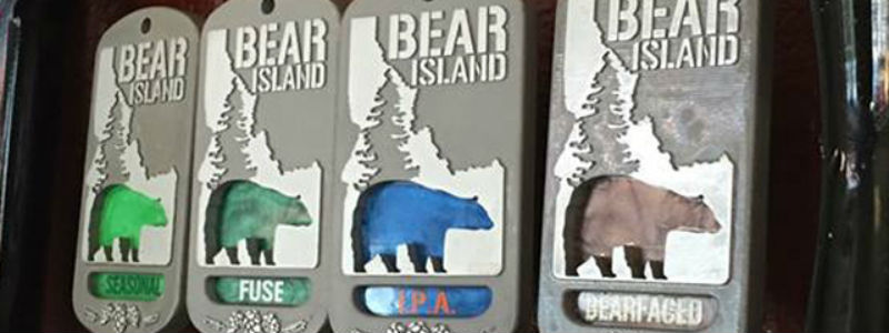
Beth Bechtel at Boise, Idaho’s Bear Island said a lot of research and development with a label printer help formed how Bear Island’s packaging would look. The nanobrewery had already had the design and came up with the basics and then worked with a label printing company’s designer to have it come to life.
“You have to find the right mix to stand out but not be obnoxious; buyers are very emotionally driven,” she said. “Consistent branding — making it obvious that each package is ours — allows those loyal customers to recognize you right away.”
Bechtel said she looked at other labels and stocks to determine what her brewery would prefer along with multiple test prints to get an idea of how the label would look to verify that it is what the brewery wanted. Plus, a strict adherence to a budget was kept in mind.
“We planned our labels to look like our tap handles way before we even labeled anything,” she said. “The other features on our bottle were just things that we would want to see on other bottles as avid craft beer consumers.”
Jim Mills, the founder and head brewer for Ashland, Oregon’s Caldera Brewing, does a lot of the design work, but says he needs professional designers to help finalize the look.
“[It] just starts in my head and blossoms from there,” Mills said, noting that the brewery recently switched to hologram labels to help stand out.
Be the first to comment