


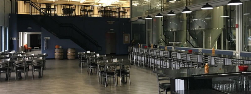
First came opening, then came the rebrand. That’s how it’s going for New Jersey’s Double Nickel Brewing, which opened its doors with a 30-barrel facility in October of 2015 and is on pace already to finish with more than 5,000 barrels of production through its second full year. Serving the greater Philadelphia area with distribution and all of New Jersey, the brewery announced a rebranding on October 16, a week prior to its second anniversary. It was a nine-month project with a new website, packaging and updates to its tasting room in the works.
“With a goal of “bridging vision and tradition” and a core series comprised of modern-brewed versions of classic beer styles, the new look more effectively conveys the personality and mission of the brewery — making beer that transcends the generational taste differences,” the brewery announced in a recent press release.
Brewer Magazine spoke with Jackie Basso, the brewery’s Director of Public Relations, on the transformation.
“So far the feedback from our community of supporters has been overwhelmingly positive and really made this exciting (and sometimes stressful) adventure worth it,” she wrote this week.
BREWER: How did the brewery decide to market the beer in terms of look, styles and story?
BASSO: There were a lot of uncertainties involved in the beginning of the brewery planning, what size brew house would we start with, how big of a building would we need, what part of NJ/PA should the brewery be, etc. … but there was one thing everyone agreed on: We wanted to pay homage to classic beer styles while adding our modern twist. Beers that everyone can appreciate and enjoy whether you’re a craft beer newcomer or a real aficionado. We are so proud of the great beer we make here, we really wanted packaging that did it justice. We did a lot of online searching for other brands we really though were cool and resonated with us, and after doing some research we found out that most of the best/iconic can designs and all of our favorites were coming from a boutique marketing firm based in Austin, Texas called Helms Workshop. We reached out to them, sent them beer, had a lot of discovery discussions about where we saw ourselves in our marketplace and where we wanted to be. Over the course of about 10 months we worked with them on our new branding and packaging and couldn’t be happier with the final outcome. Our Core Series of year-rounders are without gimmick and as advertised: award winning Vienna Lager, IPA, Session IPA, Pilsner, and a Belgian Golden Ale. We also have our summer seasonal, Laid Back Lager, and our winter seasonal, Below Zero Winter Ale. We also have a DNA Series (Double Nickel Auxiliary Series) where we really get to flex our creative muscles. Our third and next batch will be an IPA brewed with Cascara, the cherry from the coffee plant.
BREWER: How did this develop and what were key aspects addressed from the old branding?
BASSO: We wanted a brand and can design that was instantly recognizable weather you are navigating the overwhelming local bottle shop, or standing 27 feet away from someone playing cornhole at a tailgate. We also wanted a can design that just felt right sitting in your hand no matter what generation you belong to. Some things are just timeless classics that everyone can appreciate, and that is what we are trying to achieve.
BREWER: What are important elements to discuss when making changes and what do you feel are the most important changes to make to help either draw consumers or maintain loyalty?
BASSO: The most important thing for us was really understanding who made up the community we were building around our beer and brewery. We strive to reward these customers with more then just beers, but an experience that they will want to share with their friends and family.
BREWER: Where did the art direction, and the feel for the entire rebrand come from?
BASSO: We drew inspirations right from the beers that make up our Core Series, which are our modern brewed versions of classic styles of beer. We wanted the beers to speak for themselves and be modern while somehow feeling vintage. We talked a lot with Helms about this notion of bridging vision and tradition, and they helped us achieve our goal with the new look.


Be the first to comment