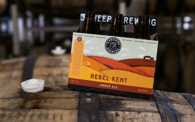
Grant Pauly said something has been bugging him for nearly a year. Even with his 3 Sheeps Brewing ready to celebrate five years since opening and now a year after expanding into a new facility with a 30-barrel system in Sheboygan, Wisconsin, the founder and brewmaster shared in a recent blog post that a rebranding was necessary as well.
“It all started at our fourth anniversary party,” he wrote about the party the brewery held in April, 2016. “We were having a blast, had just moved into our new facility, and were prone to self-reflection. We had come a long way since when we brewed our first batch of beer. The styles had matured, our ability to push boundaries continued to evolve, and we were discovering what beers we truly enjoyed brewing. As we were reflecting on this, it became apparent that the brewery we were, and the image we portray no longer fit with who we actually were.
“Fast forward to August at the Great Taste of the Midwest where a festival goer told me, ‘Grant, I really like your beer. Anytime someone gives me one, I always know it will be great. But I never think to buy it… Maybe you should think about that?’ This was the straw that broke the camel’s back. It was time to rebrand.”
So 3 Sheeps will officially celebrate its new brand designed to better represent the evolving brewery defined by a mission to brew beer with both heart and science on April 8.
The refined look is showcased with a new logo, bottle labels, packaging, and website created in collaboration with Matt Tanaka Marketing Company of Chicago, Ill.
“We realized that the beer we were making today was very different from when we started more than five years ago,” Pauly said in a release. “The styles have matured and with that our ability to push boundaries has evolved. It became apparent that the brewery we were and the image portrayed were no longer aligned.”
Upon reestablishing the mission statement – Brewing Beer with Heart & Science – the fresh look was born.
The brewery says that ‘Heart’ represents the creativity and passion to push boundaries of beer styles and flavors and ‘Science’ encapsulates a commitment to meticulous research and the scientific process in turning conceptual ideas into delicious and drinkable beer.
Pauly explains that when they started to approach the beer ‘Paid Time Off,’ they knew they wanted to make a beer with coconut and cocoa nibs.
“But we needed something else to really bring it all together,” Pauly said. “Once we realized that walnuts would be the best flavor, we had to figure out how to make it work, even though nuts are generally considered to not be compatible with brewing.
“When we’re told something can’t be done, but we know that the flavor of walnuts are the best ingredient to use in that beer, we are driven to figure it out.”
That when the science took over.
“We dissected the walnut to figure out what part of it yielded the flavors we love, and what part of it produced the negative effects in the beer. We then reached out to a walnut roaster to see if they could help us roast a walnut in a way that would minimize those negative effects. After that, we explored how we would add the walnut to the beer to maximize the desired flavors while keeping the oil content low. By doing all of these things, we were able to take an ingredient often thought to be unbrewable and make it a part of our beer.
“This is what ‘Brewed With Heart & Science’ means to us.”
The new branding on all brewery products featuring a new crisp logo, enhanced website, colorful packaging, and bottle labels with impactful coloring and imagery to communicate the concepts, ideas and flavors of the beer.
It is a rare moment when a company is able to start with a clean slate and think about who they are,” Pauly added.
“We’re usually running around, brewing, bottling, and selling beer non-stop,” he said. “The rebranding process forced us to stop and reflect on these last few years, and really figure out what was important to us. It turns out, trying to put that into a words can be very difficult. It’s even more difficult to be succinct. For us, it all boiled down to this: Brewed With Heart & Science.
“These five words became the foundation upon which we built our entire brand. Everything from our logo, to the illustrations on our new bottle labels, to the colors of our new cases stem from that concept of brewed with heart and science. And all of that was done to represent what’s most important to us: the beer.”


Be the first to comment