When Gary Fish founded Deschutes Brewery 30 years ago in the town of Bend, Oregon, less than 100 craft breweries dotted the landscape. Today, the pioneering brewery is the tenth largest craft brewery in the country. It’s also one of the most influential, based on the success of its defining legacy beers: Black Butte Porter, Mirror Pond Pale Ale, and Fresh Squeezed IPA, along with its seasonal and limited release offerings and small batch barrel‐aged experimental brews. Fish’s entrepreneurial spirit and contrarian nature drove constant innovation that fueled growth and paved the way for the craft beer revolution.
Today, over 7,000 craft breweries dot the landscape in the US. The craft beer landscape has changed dramatically and the huge increase in competition, along with concerns of oversaturation and slowing overall consumption trends, has created an inflection point, making growth difficult and innovation non‐negotiable.
The category is flooded now with craft brewers large and small who have embraced quirky, whimsical branding. “I realized that, in order to differentiate ourselves and grow, we needed to evolve our marketing approach, starting with the Deschutes branding and packaging,” Fish says. Rather than following the crowd, he reached back to his roots and chose a different direction: simple and bold to recapture his market and appeal to millennials who may not be familiar with Deschutes.
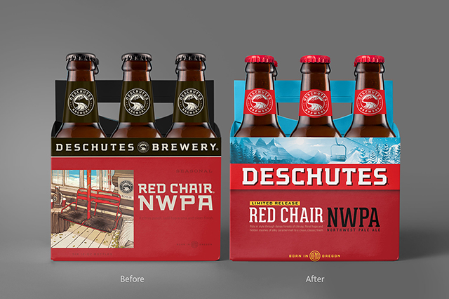
“If you look at the craft beer category now, it’s a sea of overwhelming visual noise,” says Simon Thorneycroft, Founder/CEO, of San Francisco‐based Perspective: Branding, the agency tapped for the rebrand. “The category is completely flooded by products and styles, all looking the same by trying so hard to look different. We saw an opportunity to create clarity at the shelf by putting the brand and style first, then layering in a bit of mystery through hidden stories.” These begin on the carriers with characters and illustrations that continue on the bottles depicting longevity, authenticity, and innovation, while also surprising and delighting consumers. “Elements of these stories start on one product, overlap and continue onto the next product on shelf,” he adds.
“For clarity, we shortened the name on packaging to just Deschutes, which gives the name a bigger, bolder and more iconic presence that equates with its heritage and legacy as a true pioneer. The new packaging design is a striking red and fresh blue, reflecting the colors of the soil and sky of Oregon, while also communicating refreshment, which is something often overlooked in most craft beer branding,” says Thorneycroft.
The new Deschutes packaging design system is rolling out now beginning with seasonal, Red Chair NWPA. The story on the new Red Chair packaging comes from the curious characters you meet while riding a chair lift at the mountain. These are unique moments when you connect with someone you might not otherwise meet – something that epitomizes the soul of Deschutes. Four different variations feature a skier or snowboarder with a person in flipflops, another in diving gear (a nod to their Mirror Pond packaging), a child in wellies, and Big Foot.
According to Michael LaLonde, President & CEO, Deschutes Brewery, “This packaging is much more visible, bolder and has a deeper story connecting with the consumer. Our heritage brands look new and should lead to additional sampling and a lift for those brands as well.” New products and packaging will continue to roll out throughout 2019, including the brewery’s flagships, Black Butte Porter and Mirror Pond Pale Ale. Each package pays tribute to the brewery’s legacy by featuring Central Oregon landmarks, and adds a new layer of mystery to the story.


1 Trackback / Pingback